ListTile
Examples#
Basic Example#
import flet as ft


def main(page: ft.Page):
    page.title = "ListTile Example"

    page.add(
        ft.Card(
            content=ft.Container(
                width=500,
                padding=ft.Padding.symmetric(vertical=10),
                content=ft.Column(
                    spacing=0,
                    controls=[
                        ft.ListTile(title=ft.Text("One-line list tile")),
                        ft.ListTile(
                            title=ft.Text("One-line dense list tile"),
                            dense=True,
                        ),
                        ft.ListTile(
                            leading=ft.Icon(ft.Icons.SETTINGS),
                            title=ft.Text("One-line selected list tile"),
                            selected=True,
                        ),
                        ft.ListTile(
                            leading=ft.Image(
                                src="/icons/icon-192.png",
                                fit=ft.BoxFit.CONTAIN,
                            ),
                            title=ft.Text("One-line with leading control"),
                        ),
                        ft.ListTile(
                            title=ft.Text("One-line with trailing control"),
                            trailing=ft.PopupMenuButton(
                                icon=ft.Icons.MORE_VERT,
                                items=[
                                    ft.PopupMenuItem(content="Item 1"),
                                    ft.PopupMenuItem(content="Item 2"),
                                ],
                            ),
                        ),
                        ft.ListTile(
                            leading=ft.Icon(ft.Icons.ALBUM),
                            title=ft.Text(
                                value="One-line with leading and trailing controls"
                            ),
                            trailing=ft.PopupMenuButton(
                                icon=ft.Icons.MORE_VERT,
                                items=[
                                    ft.PopupMenuItem(content="Item 1"),
                                    ft.PopupMenuItem(content="Item 2"),
                                ],
                            ),
                        ),
                        ft.ListTile(
                            leading=ft.Icon(ft.Icons.SNOOZE),
                            title=ft.Text(
                                value="Two-line with leading and trailing controls"
                            ),
                            subtitle=ft.Text("Here is a second title."),
                            trailing=ft.PopupMenuButton(
                                icon=ft.Icons.MORE_VERT,
                                items=[
                                    ft.PopupMenuItem(content="Item 1"),
                                    ft.PopupMenuItem(content="Item 2"),
                                ],
                            ),
                        ),
                    ],
                ),
            )
        )
    )


ft.run(main)
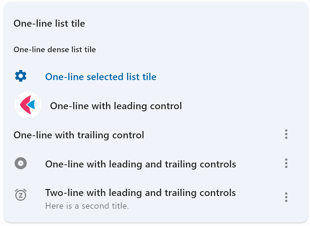
Bases: LayoutControl, AdaptiveControl
A single fixed-height row that typically contains some text as well as a leading or trailing icon.
autofocus: bool = False
True if the control will be selected as the initial focus. If there is more than
one control on a page with autofocus set, then the first one added to the page will
get focus.
content_padding: PaddingValue | None = None
- The tile's internal padding. It insets the contents of this tile.
- its
leading,title,subtitle, andtrailingcontrols.
dense: bool | None = None
Whether this list tile is part of a vertically dense list.
Dense list tiles default to a smaller height.
enable_feedback: bool | None = None
Whether detected gestures should provide acoustic and/or haptic feedback.
On Android, for example, setting this to True produce a click sound and a
long-press will produce a short vibration.
hover_color: ColorValue | None = None
The tile's color when hovered. Only takes effect if
toggle_inputs is True or if
on_click is provided.
icon_color: ColorValue | None = None
is_three_line: bool | None = None
Whether this list tile is intended to display three lines of text.
If True, then subtitle must be non-null (since it is expected to give the second
and third lines of text).
If False, the list tile is treated as having one line if the subtitle is null and
treated as having two lines if the subtitle is non-null.
When using a Text control for title and subtitle, you can enforce line limits
using Text.max_lines.
leading_and_trailing_text_style: TextStyle | None = None
The TextStyle for the
leading and trailing controls.
min_height: Number | None = None
The minimum height allocated for this control.
If None or not set, default tile heights are 56.0, 72.0, and 88.0 for one,
two, and three lines of text respectively.
If dense is True, these
defaults are changed to 48.0, 64.0, and 76.0.
Note that, a visual density value or a large title will also adjust the default tile heights.
min_leading_width: Number | None = None
The minimum width allocated for the leading control.
min_vertical_padding: Number | None = None
The minimum padding on the top and bottom of the title and subtitle controls.
mouse_cursor: MouseCursor | None = None
The cursor to be displayed when a mouse pointer enters or is hovering over this
control. The value is MouseCursor
enum.
on_click: ControlEventHandler[ListTile] | None = None
Called when a user clicks or taps the list tile.
on_long_press: ControlEventHandler[ListTile] | None = None
Called when the user long-presses on this list tile.
selected: bool = False
If this tile is also enabled then icons and text are rendered with the same color. By default the selected color is the theme's primary color.
selected_color: ColorValue | None = None
Defines the color used for icons and text
when selected=True.
selected_tile_color: ColorValue | None = None
Defines the background color of ListTile
when selected=True.
splash_color: ColorValue | None = None
The list tile's splash color after the control has been tapped.
style: ListTileStyle | None = None
Defines the font used for the title.
Defaults to ListTileStyle.LIST.
subtitle: StrOrControl | None = None
Additional content displayed below the title.
If is_three_line is False, this should not wrap.
If is_three_line is True, this should be configured to take a maximum of two
lines.
For example, you can use Text.max_lines to enforce the
number of lines.
Typically a Text control.
subtitle_text_style: TextStyle | None = None
The TextStyle for the
subtitle control.
text_color: ColorValue | None = None
title: StrOrControl | None = None
A control to display as primary content of the list tile.
Typically a Text control. This should not
wrap. To enforce the single line limit, use Text.max_lines.
title_alignment: ListTileTitleAlignment | None = None
Defines how leading and trailing are vertically aligned relative to the titles
(title and subtitle).
Defaults to ListTileTitleAlignment.THREE_LINE in Material 3 or
ListTileTitleAlignment.TITLE_HEIGHT in Material 2.
trailing: IconDataOrControl | None = None
The URL to open when this button is clicked.
Additionally, if on_click event callback is provided,
it is fired after that.
visual_density: VisualDensity | None = None
Defines how compact the control's layout will be.