SegmentedButton
Examples#
Basic Example#
import flet as ft


def main(page: ft.Page):
    def handle_selection_change(e: ft.Event[ft.SegmentedButton]):
        print(e)

    page.add(
        ft.SegmentedButton(
            on_change=handle_selection_change,
            selected_icon=ft.Icon(ft.Icons.CHECK_SHARP),
            selected=["1"],
            allow_empty_selection=True,
            allow_multiple_selection=True,
            segments=[
                ft.Segment(
                    value="1",
                    label=ft.Text("1"),
                    icon=ft.Icon(ft.Icons.LOOKS_ONE),
                ),
                ft.Segment(
                    value="2",
                    label=ft.Text("2"),
                    icon=ft.Icon(ft.Icons.LOOKS_TWO),
                ),
                ft.Segment(
                    value="3",
                    label=ft.Text("3"),
                    icon=ft.Icon(ft.Icons.LOOKS_3),
                ),
                ft.Segment(
                    value="4",
                    label=ft.Text("4"),
                    icon=ft.Icon(ft.Icons.LOOKS_4),
                ),
            ],
        ),
        ft.SegmentedButton(
            on_change=handle_selection_change,
            selected_icon=ft.Icon(ft.Icons.ONETWOTHREE),
            selected=["2"],
            allow_multiple_selection=False,
            segments=[
                ft.Segment(
                    value="1",
                    label=ft.Text("1"),
                    icon=ft.Icon(ft.Icons.LOOKS_ONE),
                ),
                ft.Segment(
                    value="2",
                    label=ft.Text("2"),
                    icon=ft.Icon(ft.Icons.LOOKS_TWO),
                ),
                ft.Segment(
                    value="3",
                    label=ft.Text("3"),
                    icon=ft.Icon(ft.Icons.LOOKS_3),
                ),
                ft.Segment(
                    value="4",
                    label=ft.Text("4"),
                    icon=ft.Icon(ft.Icons.LOOKS_4),
                ),
            ],
        ),
    )


ft.run(main)
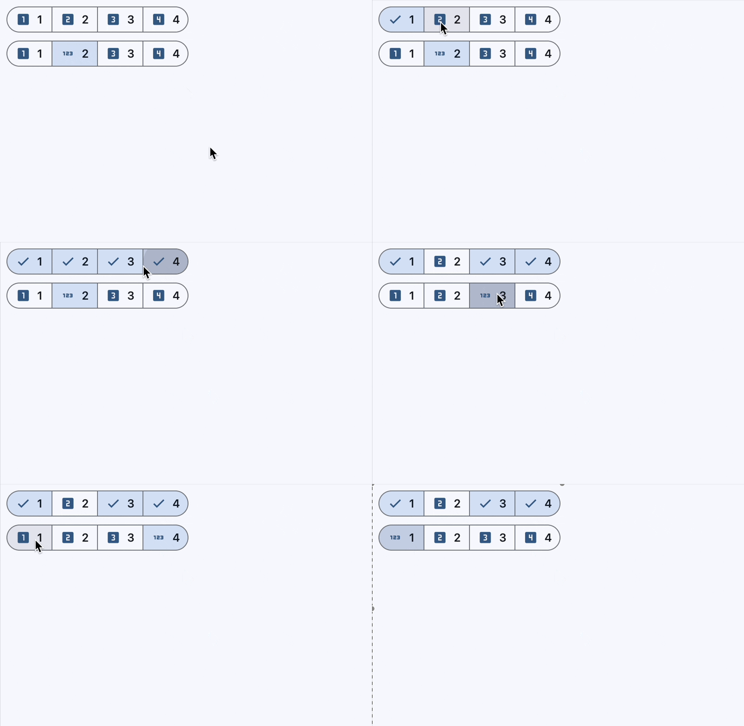
Bases: LayoutControl
A segmented button control.
| RAISES | DESCRIPTION |
|---|---|
AssertionError
|
If |
AssertionError
|
If |
AssertionError
|
If |
allow_empty_selection: bool = False
A boolean value that indicates if having no selected segments is allowed.
If True, then it is acceptable for none of the segments to be selected and also
that selected can be empty.
If False (the default), there must be at least one segment selected. If the user
taps on the only selected segment it will not be deselected, and on_change will
not be called.
allow_multiple_selection: bool = False
A boolean value that indicates if multiple segments can be selected at one time.
If True, more than one segment can be selected. When selecting a segment, the
other selected segments will stay selected. Selecting an already selected segment
will unselect it.
If False (the default), only one segment may be selected at a time. When a segment
is selected, any previously selected segment will be unselected.
direction: Axis | None = None
The orientation of the button's segments.
Defaults
to Axis.HORIZONTAL.
on_change: ControlEventHandler[SegmentedButton] | None = (
    None
)
Called when the selection changes.
The data property of the event handler argument
contains a list of strings identifying the selected segments.
padding: PaddingValue | None = None
Defines the button's size and padding. If specified, the button expands to fill its parent's space with this padding.
When None, the button adopts its intrinsic content size.
A set of Segment.values that indicate which segments are selected. It is updated
when the user (un)selects a segment.
selected_icon: IconDataOrControl | None = None
An Icon control that is used to indicate a segment is selected.
If show_selected_icon is True then for selected segments this icon will be
shown before the Segment.label, replacing the Segment.icon if it is specified.
Defaults to an Icon with the CHECK icon.
show_selected_icon: bool = True
A boolean value that indicates if the selected_icon is displayed on the
selected segments.
If True, the selected_icon will be displayed at the start of the selected
segments.
If False, then the selected_icon is not used and will not be displayed on
selected segments.
Bases: Control
A segment for a SegmentedButton.
| RAISES | DESCRIPTION |
|---|---|
AssertionError
|
icon: IconDataOrControl | None = None
The icon (typically an Icon) to be
displayed in the segment.
label: StrOrControl | None = None
The label (usually a Text) to be
displayed in the segment.