NavigationDrawer
Examples#
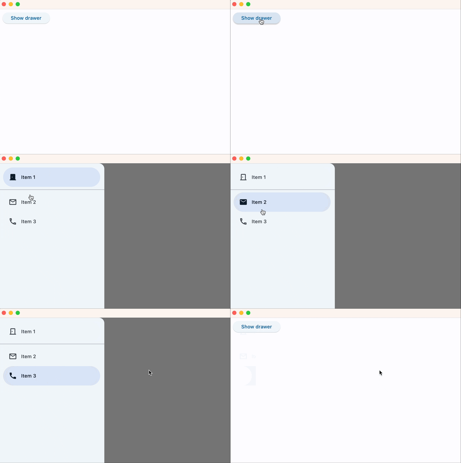
Start-aligned drawer#
import flet as ft


def main(page: ft.Page):
    def handle_dismissal(e: ft.Event[ft.NavigationDrawer]):
        print("Drawer dismissed!")

    def handle_change(e: ft.Event[ft.NavigationDrawer]):
        print(f"Selected Index changed: {e.control.selected_index}")
        page.pop_dialog()

    drawer = ft.NavigationDrawer(
        on_dismiss=handle_dismissal,
        on_change=handle_change,
        controls=[
            ft.Container(height=12),
            ft.NavigationDrawerDestination(
                label="Item 1",
                icon=ft.Icons.DOOR_BACK_DOOR_OUTLINED,
                selected_icon=ft.Icon(ft.Icons.DOOR_BACK_DOOR),
            ),
            ft.Divider(thickness=2),
            ft.NavigationDrawerDestination(
                icon=ft.Icon(ft.Icons.MAIL_OUTLINED),
                label="Item 2",
                selected_icon=ft.Icons.MAIL,
            ),
            ft.NavigationDrawerDestination(
                icon=ft.Icon(ft.Icons.PHONE_OUTLINED),
                label="Item 3",
                selected_icon=ft.Icons.PHONE,
            ),
        ],
    )

    page.add(
        ft.Button(
            content="Show drawer",
            on_click=lambda e: page.show_dialog(drawer),
        )
    )


ft.run(main)
End-aligned drawer#
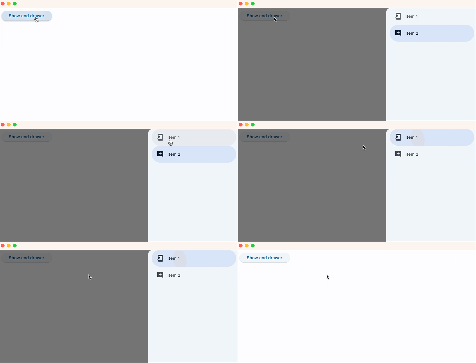
import flet as ft


def main(page: ft.Page):
    def handle_dismissal(e: ft.Event[ft.NavigationDrawer]):
        print("End drawer dismissed")

    def handle_change(e: ft.Event[ft.NavigationDrawer]):
        print(f"Selected Index changed: {e.control.selected_index}")
        page.pop_dialog()

    end_drawer = ft.NavigationDrawer(
        position=ft.NavigationDrawerPosition.END,
        on_dismiss=handle_dismissal,
        on_change=handle_change,
        controls=[
            ft.NavigationDrawerDestination(
                icon=ft.Icons.ADD_TO_HOME_SCREEN_SHARP,
                label="Item 1",
            ),
            ft.NavigationDrawerDestination(
                icon=ft.Icon(ft.Icons.ADD_COMMENT),
                label="Item 2",
            ),
        ],
    )

    page.add(
        ft.Button(
            content="Show end drawer",
            on_click=lambda e: page.show_dialog(end_drawer),
        )
    )


ft.run(main)
Bases: DialogControl
Material Design Navigation Drawer component.
Navigation Drawer is a panel slides in horizontally from the left or right edge of a page to show primary destinations in an app.
Defines the appearance of the items within the navigation drawer.
The list contains NavigationDrawerDestination items and/or other controls such as
headlines and dividers.
indicator_color: ColorValue | None = None
The color of the selected destination indicator.
indicator_shape: OutlinedBorder | None = None
The shape of the selected destination indicator.
on_change: ControlEventHandler[NavigationDrawer] | None = (
    None
)
Called when selected destination changed.
selected_index: int = 0
The index for the current selected NavigationDrawerDestination or null if no
destination is selected.
A valid selected_index is an integer between 0 and number of destinations - 1. For
an invalid selected_index, for example, -1, all destinations will appear
unselected.
shadow_color: ColorValue | None = None
The color used for the drop shadow to
indicate elevation.
tile_padding: PaddingValue | None = None
Defines the padding for destination controls.