DropdownM2
Examples#
Basic Example#
import flet as ft


def main(page: ft.Page):
    page.theme_mode = ft.ThemeMode.DARK

    def handle_button_click(e):
        message.value = f"Dropdown value is:  {dd.value}"
        page.update()

    page.add(
        dd := ft.DropdownM2(
            width=100,
            options=[
                ft.dropdownm2.Option("Red"),
                ft.dropdownm2.Option("Green"),
                ft.dropdownm2.Option("Blue"),
            ],
        ),
        ft.Button(content="Submit", on_click=handle_button_click),
        message := ft.Text(),
    )


ft.run(main)
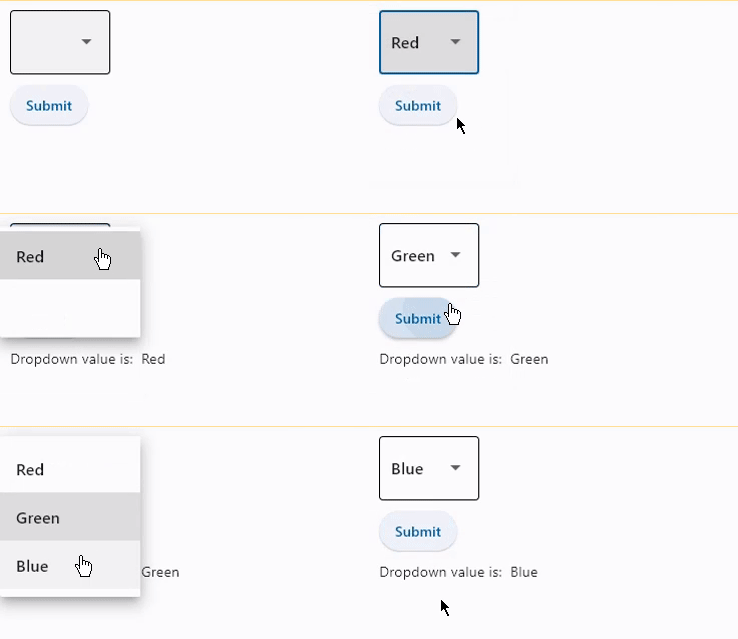
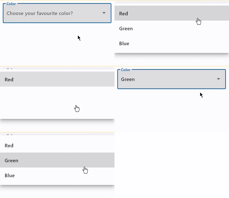
Dropdown with label and hint#
import flet as ft


def main(page: ft.Page):
    page.add(
        ft.DropdownM2(
            label="Color",
            hint_text="Choose your favourite color?",
            autofocus=True,
            color=ft.Colors.BLACK,
            options=[
                ft.dropdownm2.Option("Red"),
                ft.dropdownm2.Option("Green"),
                ft.dropdownm2.Option("Blue"),
            ],
        )
    )


ft.run(main)
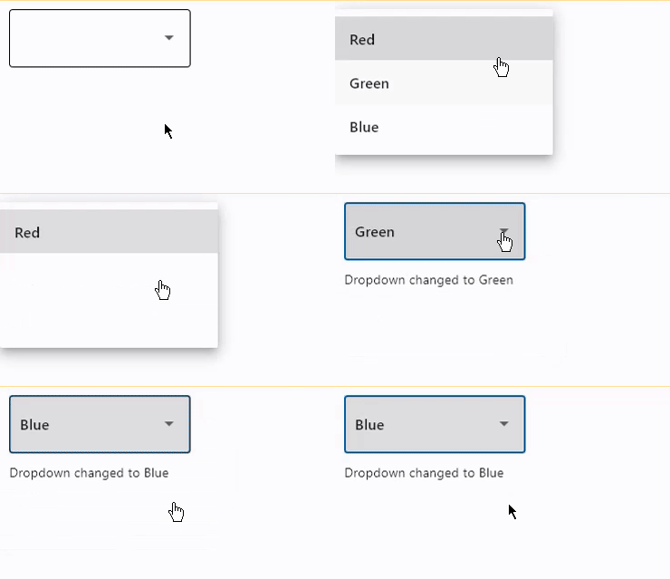
Handling events#
import flet as ft


def main(page: ft.Page):
    def dropdown_changed(e: ft.Event[ft.DropdownM2]):
        message.value = f"Dropdown changed to {e.control.value}"
        page.update()

    page.add(
        ft.DropdownM2(
            width=200,
            color=ft.Colors.BLUE_GREY_700,
            on_change=dropdown_changed,
            options=[
                ft.dropdownm2.Option("Red"),
                ft.dropdownm2.Option("Green"),
                ft.dropdownm2.Option("Blue"),
            ],
        ),
        message := ft.Text(),
    )


ft.run(main)
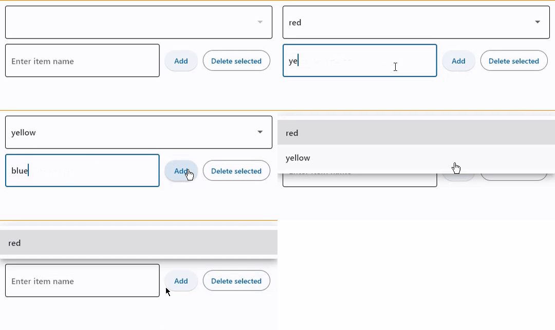
Add and delete options#
import flet as ft


def main(page: ft.Page):
    def find_option(option_name):
        for option in dropdown.options:
            if option_name == option.key:
                return option
        return None

    def handle_addition(e: ft.Event[ft.Button]):
        dropdown.options.append(ft.dropdownm2.Option(input_field.value))
        dropdown.value = input_field.value
        input_field.value = ""
        page.update()

    def handle_deletion(e: ft.Event[ft.OutlinedButton]):
        option = find_option(dropdown.value)
        if option is not None:
            dropdown.options.remove(option)
            # d.value = None
            page.update()

    page.add(
        dropdown := ft.DropdownM2(options=[], color=ft.Colors.BLUE_400),
        ft.Row(
            controls=[
                input_field := ft.TextField(hint_text="Enter item name"),
                ft.Button(content="Add", on_click=handle_addition),
                ft.OutlinedButton(
                    content="Delete selected",
                    on_click=handle_deletion,
                    style=ft.ButtonStyle(bgcolor=ft.Colors.RED),
                ),
            ]
        ),
    )


ft.run(main)
Bases: FormFieldControl
A dropdown lets the user select from a number of items. The dropdown shows the currently selected item as well as an arrow that opens a menu for selecting another item.
alignment: Alignment | None = None
Defines how the hint or the selected item is positioned within this dropdown.
autofocus: bool = False
True if the control will be selected as the initial focus. If there is more than one control on a page with autofocus set, then the first one added to the page will get focus.
disabled_hint_content: Control | None = None
A placeholder Control for the dropdown's value that is displayed when value is
None and the dropdown is disabled.
enable_feedback: bool | None = None
Whether detected gestures should provide acoustic and/or haptic feedback. On
Android, for example, setting this to True produce a click sound and a long-press
will produce a short vibration.
hint_content: Control | None = None
A placeholder Control for the dropdown's value that is displayed when value is
None.
item_height: Number | None = None
The height of the items/options in the dropdown menu.
on_blur: ControlEventHandler[DropdownM2] | None = None
Called when the control has lost focus.
on_change: ControlEventHandler[DropdownM2] | None = None
Called when the selected item of this dropdown has changed.
on_click: ControlEventHandler[DropdownM2] | None = None
Called when this dropdown is clicked.
on_focus: ControlEventHandler[DropdownM2] | None = None
Called when the control has received focus.
options: list[Option] | None = None
A list of Option controls representing items in this dropdown.
options_fill_horizontally: bool = True
Whether the dropdown's inner contents to horizontally fill its parent. By default this button's inner width is the minimum size of its content.
If True, the inner width is expanded to fill its surrounding container.
padding: PaddingValue | None = None
The padding around the visible portion of this dropdown.
select_icon: IconDataOrControl | None = None
The name of the icon or Control to use
for the drop-down select button's icon.
Defaults to Icon(ft.Icons.ARROW_DROP_DOWN).
select_icon_disabled_color: ColorValue | None = None
The color of any Icon descendant of select_icon if this button is disabled.
select_icon_enabled_color: ColorValue | None = None
The color of any Icon descendant of select_icon if this button is enabled.